Tuesday, 30 March 2010

What we have learnt about technologies from the process of constructing out media product


Since I began our film opening project for Translation Check I feel that i've gained a lot of skills and knowledge about editing software and the problems that can occur whilst filming. First of all I learnt about operating a camera and the importance of keeping the tripod steady while filming. I also learned how to edit a film sequence on Final Cut Express which included skills such as deleting sections, adding sections in, adding in credits, adjusting sound levels and using different tools such as the razorblade. To create the title designs for Translation Check I honed my skills on Photoshop using different colours, fonts and layers until we were happy with the final result.
I learned the foundation elements in a blog for example how to edit, add images and publishing.
Lorna

During the process of our film opening, I’ve learnt how to have a input in different various designs for the title of our film, Translation Check. I also learnt how to edit different scenes with Tosin. I also had an input in the background research for the distribution of teen films. I helped, with
blogging different posts, for our film opening. Throughout the proc
essing of our film opening, I learnt how to use these technologies to the fullest of my ability. I have learnt how to do use these methods accurately to get good results overall, for the construction of this product.

Priscilla

For me I used technologies such as Photoshop, Adobe after effects, final cut pro, a recorder for recording my younger sister playing the song mem

ory of light and waves on the piano, to use for out film, I filmed a few scenes using the camera. I already had experience in Photoshop, so I just applied what I had already knew to designing the logo and taught Priscilla extra stuff on Photoshop. I already had experience on how to use blogger, so it wasn’t difficult in getting a new template design for it and personalize it to suit our group, iFlooky. In Photoshop I designed the final translation check logo as well as the iFlooky logo with Priscilla. I edited the first cut of our film, and learnt how to use a bit of after effects.

Tosin

Through out this project, i have learnt to use final cut express. the program was quite difficult to use at first, but after viewing various tutorials, editing the film

was second nature, if we were to ever create another film, i would prefer to use iMovie as it is not as complicated as final cut though more can be done in final cut.

Stella
Sunday, 28 March 2010

Distributor

For a comedy teen film like ours, it was quite easy to find a few distributors that distribute films like ours. Our two choices were Lionsgate and The Walt Disney company

Lionsgate
Lionsgate is the leading next generation studio with a major presence in production and distribution of motion pictures, television programming, home entertainment, family entertainment, video-on-demand and delivered content.
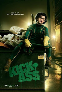
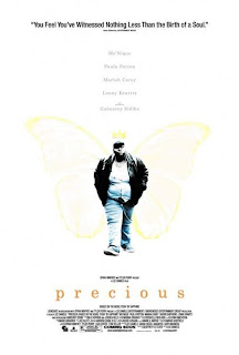
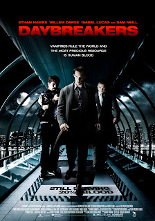
The Company is an industry market share leader at North America theatrical box office. Films that Lionsgate have done are: Day breakers, Kick-ass, the spy next door, Saw v11 3D, Saw v, the lucky ones, precious, from Paris with love, the eye and Bratz: the movie.Lionsgate was one of our choices since it had alot of family films and in particular comedies and teen films.
http://investors.lionsgate.com/


The Walt Disney Company

It is the worlds largest media and entertainment conglomerate in the world. Founded in 1923 by the Disney brothers.The company is best known for the products of its film studio, the Walt Disney Motion Pictures Group, today one of the largest and best-known studios in Hollywood. Disney also owns and operates the ABC broadcast television network; cable television networks such as Disney Channel, ESPN, and ABC Family; publishing, merchandising, and theatre divisions; and owns and licenses eleven theme parks around the world. The company has been a component of the Dow Jones Industrial Average since May 6, 1991. An early and well-known cartoon creation of the company, Mickey Mouse, is the official mascot of The Walt Disney Company.

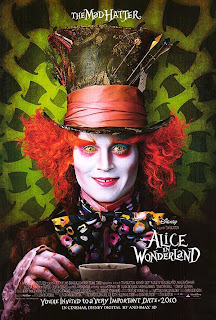
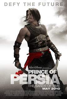
Disney was our next choice as it has released many teen films, such as Alice in wonderland 2010, Prince of Persia, High school musical and many more films targeted towards a family and teenage audience.

http://home.disney.co.uk/

For our film Translation Check, we decided to not go with The Walt Disney Company but Lionsgate, though Disney has a very good family friendly reputation and it has distributed many successful films that all age groups have enjoyed.

The only thing about having Disney distribute our film 'Translation check' is that it would be alot more expensive and if the film is not likely to receive good reception from their own target audience and won't be successful in appealing to them either, the film won't be distributed by them.
Also, with Disney as a distributor, we would have to apply our film to their terms a lot, especially in cases involving censorship and age rating and we won't be as flexible in our original conception as Disney would have scenes, scripting and many more things changed to suit their image, even though our film does suit in well to the typical disney teen film, it still appeals to a much younger audience.


We decided to go with Lionsgate as they have films that appeal to a much older audience between 12 and 18. They have a good range of films that are comedies and teen films and in comparison to Disney it would be a lot more cheaper.

Tuesday, 23 March 2010

How does your media product represent particular social groups?


Otaku/Wanabee
The wanabee in a teen film is the person, through all attempts tries to imitate the persona and traits of a type of people or person.

Coco, is an otaku, someone who is obsessed with japanese animation and culture. So in every attempt she tries to imitate japanese culture, through words and fashion. usually
through the word 'BAKA' meaning 'Idiot'

A character who is similar to coco is a character from "Not Another Teen Movie" called Bruce. In the film his stereotype is the asian wanabee, and he attempts asian characteristics, through use of language and clothes.
Tosin

Geek
Cynthia is the geek character in Translation Check. She's accident prone and isn't as smart as people would believe she is. We used typical conventions of a geek to create cynthia such as having her reading a book, wearing glasses, tucking her t-shirt in and having long white socks.
Generally speaking, geeks are seen to have a "nose to book" attitude to life (as media presents this social class)

They are also seen as the primary prey to bullies alike as they either have little or no friends and geeks also tend to give priorities to their academic career.

Their costume generally consists of:
Large glasses (sometimes taped togetherPlaid shirts (usually tucked in)
Pockets filled with pens (sometimes with pocket
protectors)
Suspenders
Long white socks

This character is from the film Napoleon Dynamite, (has the same name as the film) he is seen as socially awkward throughout the film, similar to Cynthia.
We can also see that this characters' attire fits the stereotypical definition of a geek a geek as he is wearing large glasses and a white shirt.
Stella

Loner
Here is a picture of Nicolla, which captures a midshot, which shows alot of emotion in her facial expression. It shows a reprenstation of a lonely person, who is expressive when showing her emotions to other people. A character that reinforces this representation, is Bella in Twilight, who also plays a loner character.

Bella (Twilight) falls in love with a boy called Edward. Later in the story she becomes a vampire. Likewise in our teen opening Nicolla is a loner character, but Bella's character also challenges the representation of being lonely, because she falls in love with someone, and at that point shes no longer a loner character.
Priscilla


Bully
This is Tuesday, the bully in our film. She is also a troublemaker, in fact causing trouble is a hobby of hers. Tuesday knows everything about everyone, which she uses to her full advantage with blackmailing to get people to do what she wants.

The bully often the one person everybody knows for the wrong reasons. Bullies inflict both emotional and sometimes physical pain on the weak and emotionally unstable. Most of the time they pick on the weaker because it makes them feel stronger and in control which is something they usually haven't had in their own lives.

John Bender from the Breakfast Club is a prime example of a typical bully character with the additional characteristics of a rebel and troublemaker all wrapped into one. Bender fulfills the steriotypical conventions of a bully such as looking down to authority, abiding by his own rules, pushing other people into doing things they don't want to do. Bender got into Saturday detention because of his troublemaking antics; meaning pulling a false fire alarm.
Lorna

In what ways does your media product use, develop or challenge forms and conventions of real media products?

Convention 1:
Lead protagonist has a secret talent
In a lot of teen films the lead
protagonist who is often a character who usually keep to themselves; has a secret talent that their exceptionally good at times but shy away from showing these talents due to embarrassment, privacy concerns or they believe they will be shunned for such a talent.
We developed this convention by our lead protagonist Nicolla, the Loner having a secret talent for playing the piano. She is a character who keeps to herself although she has friends none of them know of her secret talent.
Lorna


Convention 2:
Teen Films are set in a educational environment
Teen films are usually set in a location where a lot of young people gather. For example in a school.


We also set our film in a school to conform to this convention.
Lorna


Convention 3:
Teenagers have fun
Teenagers in teen films often don’t do as they are supposed to, act irresponsible and have fun. In films, they are often shown as an age group that is immune to hardships and if difficult times are given, it is often glamourised or 'Glossed' over.
We developed this convention with one of our characters dancing around the reception while lessons are going on.


Priscilla


Convention 4:
Teenagers and young people get into fights.
Films that are targeted towards a teenage audience are known to be full of rowdy and rebellious teenagers who alienate each other because of their social group.We developed this convention by having the Otaku and the Bully have a short fight sequence to show that people who have opposing beliefs and hobbies create conflict, amongst them.
A film where something similar has happened is in mean girls, there are quite a few fight scenes in the film and in many other teen films. Tosin


Convention 5:

Bright and colourful environments
Teen films are often set in sunny colourful places. The characters also wear bright colours. As seen from this shot from HSM 2.
We went against this convention by filming our opening on a dull grey February day. Although we had
our characters wear bright clothing
to brighten the film up and have the inside of the building a lot more brighter as if school, is a sort of escape from the outside world.
Tosin

Convention 6:

In many teen films we usually find that the geeks of the film tend to suffer and that bad luck seems to follow wherever the geek goes.

This is a stereotypical comical convention for a teen film, which we have utilized in our film.

Stella


Convention 7:

Also, we have discovered that the prop that a geek is most likely to carry around is a book (Companionship). So we have managed to conform to the convention of geeks stereotypically carrying "dull" props such as books.
Stella


Convention 8: Teenage groups and cliques

Teenagers normally like to be in cliques because they feel comfortable to be in group, rather than being alone.
Girl cliques are complex and multilayered and most girls assume a role within the clique. Social positions within the clique are not static, as a girl can lose her position within the hierarchy to another girl. They can move up and down this particular social status.
This picture shows a representation of a girl clique because there all standing together.

Priscilla


Sunday, 21 March 2010

Animated logos and after effects

For the beginning we were able to create an animated logo, with help from one of our actresses, Sharifa Reynolds. The logo was designed on photoshop and we decided to use our "sparkle alternative" design instead as there were technical difficulties with our main one.


Two different sequences were made using after effects, it was pretty difficult but we prevailed at the end. Using after effects for the first time was pretty difficult and having to learn how to use the program in such a small space of time, had made the task even more difficult.


Version 1.


This was the version we had chosen for our film, we downloaded some presets for after effects to get the arrows in. The camera tool was used to rotate the logo a bit. We wanted something simple yet fun for our title animation so we used arrows, to really express the youthfulness and silliness of our production company and with Tosin spending ages in front of the laptop trying to get the perfect 'pop' sound.

Version 2

This version was made using another preset and the camera tool, to turn it into a 3D object, the problem we encountered with this version was the sudden jump it had at the end and it wasn't smooth enough.

Final Film Openings

Due to our audience feed back we found ourselves stuck between two final versions of our opening. The first includes cuts of the classroom scene, including Lorna's "Hey your that piano girl aren't you?" line and the title coming in directly after.


In the second version the opening scene finishes with Nicolla's feet as the classroom door slams. We cut out the classroom scene due to people being confused about what was going on and how all the characters got there. It wasn't clear that it was a late detention scene. This was our final version of our film.


Presentation

Below is the presentation we showed at the start of our project.


Wednesday, 17 March 2010

Film Suggestions

After re-watching the entire film, we have managed to establish a detailed analysis of further corrections that need to be made:
  • Piano sequence - The music needs to fade in, as it seems to start quite quickly
  • The credits should come at the right part, e.g. the name should come next to the person playing the character
  • Priscilla's name should have a short pause as she is the main character
  • "Title make over" - The explanation mark in the title must be removed as it looks rather unprofessional.
  • The "O.D.D" and '!' should also be removed to improve the appearance of the title, however, the same font can be used
  • We must cut the speaking/walking scene even further
  • Remove long shots of Priscilla walking
  • Add quick shots of the characters in the classroom
  • And finally, when Lorna says "Aren't you that piano girl?", we should put the title there (at the end of the scene)

Monday, 15 March 2010

Audience Feedback

Below is the video we showed in our first auidence screening


Based on the audience feedback, we came to the following conclusion:
  • The blackouts are too long
  • The shot reverse shot needs to flow more
  • The piano sequence needs to be shorter
  • The walking sequence has too many rough cuts
  • We need to make the conversation shorter
  • We need to edit the classroom sequence (or cut it out completely)
  • Have a freeze frame and a description of the person within the classroom scene as an alternative.
In our questionnaire everybody liked the comedy aspect of the film as well as our epic fight scene, one part of our film that felt strange was the transition from the piano scene to the walking scene as the contrast of music, gave off two different types of tones.

so what we have decided to do is:
  • To shorten the conversation with Nicolla and Grace.
  • In the classroom scene, do the freeze frame idea if possible, if it still doesn't work out, we will scrap it all together, as a majority of the audience said that we should get rid of it.
  • we may shorten the piano scene.
  • we are cutting out the bit Coco sticks out her tongue.

Tuesday, 9 March 2010

Translation Check O.D.D: The Title Design

Finding an appropriate title design for our film has proven to be very difficult as we will need to create a title design that suits the overall style of the film.
We used Photoshop to create our title designs, and we have managed to come up with many variations that are suitable for the film.
We are currently re-designing our original title design because, as a group we felt as though the title did not suit the film.
We also came to a conclusion that the title design seemed too "gir
ly" and the extensive use of bright colours subverted the idea of the film originally being targeted at teenagers; the original title design seemed unintentionally inviting to younger viewers.


10/03/10
We have re-designed our Title Design, and we have decided to go with the image below:


19/03/10
Below is our final design for our film. We shortened the name from Translation Check! O.D.D to Translation Check because we felt it wasn't professional enough for our film.

Saturday, 6 March 2010

Music for film

As our film has quite a focus on music we wanted that to be displayed right at the beginning of our film. so the audience straight away get an idea of what the film would be about. In the beginning, we start with a piano sequence, the audio we used was from Tosin's younger sister playing the song, memory of light and waves from the game, "Final Fantasy X-2" and the song was composed and arranged by Noriko Matsueda and Takahito Eguchi. For our film, we had Tosin's talented younger sister Kumbi Oluyadi play the song on the piano for us to give more of an authentic sound to the piano.


The reason for picking this song was because it gave a sense of something like a dream and reminisence, as the song was mellow and very soft, and through the song was a sense of longing, and as nicolla's past is something that she misses, it made the song even more ideal.

we also got our other songs from a site called audio.lgfl.org.uk/.
The song is called skate park.
Before picking skate park, we decided between a few other songs which were in the bright and optimistic folder. the two other songs were touch me 2 and big heat.


we chose skate park for it's upbeat rhythm and it was quick paced but not too fast. It gave more of a feel that a teen film gives, this is why it was our first choice, as it was goofy yet upbeat.

Wednesday, 3 March 2010

Piano Scene


Here is a shot of our first scene from Nicolla's past, where she is playing a song on the piano.
We believe it is a level 3 because the shot is steady long shot, Nicolla's mise-en-scene is appropriate for her character and the evidence is proficent to the sequence. We chose a long higher angle shot to show the background of the room and to show her loneliness and isolation.
We included the red curtains in the background to connote Nicolla's passion for playing the piano which contradicts her character later on in the sequence.
To improve to a level 4 we could have closed the curtains and turned the piano around so she could be seen better with light on her face.

Tuesday, 2 March 2010

The Editing Process...


Today, Tosin and Priscilla finally began editing our opening sequence.The first few stages of editing were quite difficult for the group as we were struggling to even connect the camera to the computer (via the firewire cable)
We soon realised the shots of Priscilla playing the piano didn't quite fit the sound we had so we spent some time trying to fiddle with it to make it look and sound realistic.


Whist Stella and Lorna have been tediously searching the Internet for copyright-free music files that will suit the fight scene that features Coco (Tosin) and Tuesday (Amina)

Finding music for the fight scene has proved to be difficult as we needed to find an audio file that can easily be linked to the "tempo" and the overall style of the fight.

E.g. heavy metal music would not be appropriate for the fight as it is not so much of a serious brawl.

09/03/10
Today, we continued our editing until we came across a problem with playing back our work. A dialog box appeared on the screen explaining that the computer does not have enough space to render the project. We are not entirely sure about what this warning means, but we are tying to find a solution for this problem.

To add onto our problems, we also found a continuity error in our film. In one of our scenes Nicolla appears with a bag and many seconds later, the bag "mysteriously" disappears. We were disappointed when we realized that we had re-created a classical continuity error as we knew that there would not have been enough time to re-shoot the scene.

We will also have to cut large parts of the film out as we have recently discovered that the total time for our footage is at least 5:00 minutes long, and getting rid of a significant amount good footage will be very upsetting for the group as a whole.